To add a Historical Chart to one of your personal dashboard displays, click the add (
Adding Charting Options
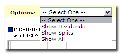
To display dividends, splits or both within the historical chart display, select from the option selector.
Changing the Timeframe
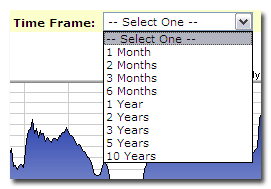
By default, the historical chart displays 1 year of data. Using the time frame selector, choose from:
• 1 Month
• 2 Months
• 3 Months
• 6 Months
• 1 Year
• 2 Years
• 3 Years
• 5 Years
• 10 Years
Performing Comparisons
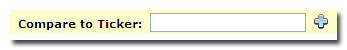
To compare the current company with an additional company, simply enter the ticker symbol in the "Compare to Ticker" field and click the add (![]() ) icon.
) icon.
Switching Historical Charting Views
By default, Historical Charts display in a Mountain View style. Switch to a Candlestick view, Straight Line view, or OHLC (Open High Low Close) view by clicking the appropriate link displayed underneath the chart.
![]()